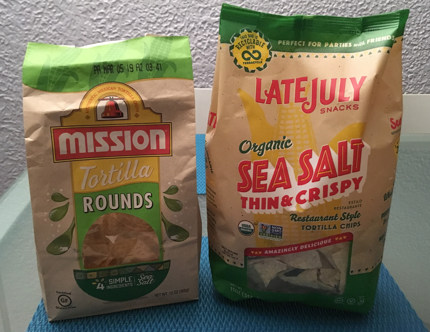
I happened to have an almost finished bag of chips on the table, next to a new bag I just picked up — and I noticed that the bags look almost identical! Well, at least at first glance.
Both bags
- similar colors in similar locations
- large green stripe across the top
- bold red brand name
- color palettes of “natural brown paper bag,” “corn-ear yellow,” “corn-stalk green,” and prominent use of red
- subtle watermark-style corn graphics
scrip ty fonts- little windows to see the chips
- chip-shaped textures and decorations
Trademark industry-me would say these bags could be deemed “confusingly similar,” because they are the same product in the same goods & services class — but the logos themselves are different.
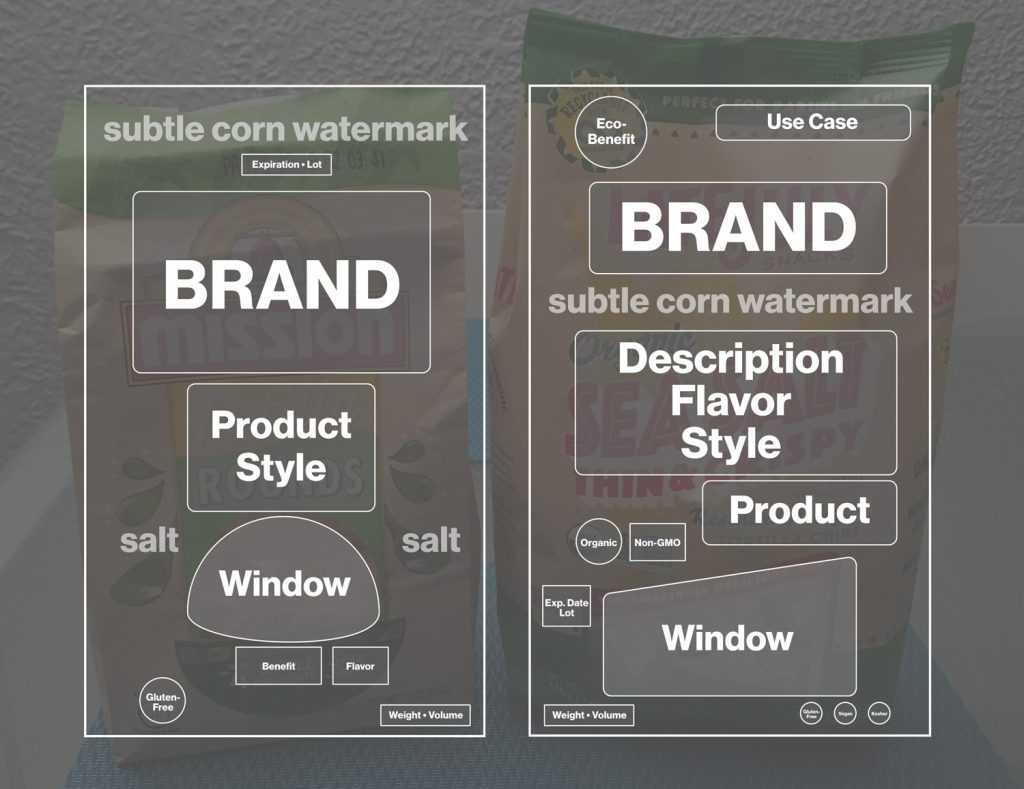
It prompted me to break down the information a bit more to see the differences. In this case, a wireframe of each bag helps define the bag space allocation and messaging without the style applied — a much easier way of evaluating the content and hierarchy of information.
Reduce the designs to wireframes for easier analysis

Now that we can see things this way, package design aside, we can see that the bag on the right, Late July, has a lot more information on it pertaining to why you want these chips, where to eat them, and a few more dietary certifications. The organic /
So basically, Mission is selling Tortilla Rounds made from 4 simple ingredients including sea salt and Late July is selling Organic Sea Salt Thin & Crispy Restaurant Style Tortilla Chips which are amazingly delicious and perfect for parties with friends. Wow, that’s a mouthful (pun intended), but at least I know what to expect from my chips and how to enjoy them. Do I need to know this? I’m not sure. I’ve had plenty of chips before so I already know I can have them at parties with friends, I’m more concerned about the style and flavor of the chip — “thin & crispy” makes it more enticing.
If I were a first-time chip buyer and saw them side-by-side on a shelf and had to choose, I would next evaluate them based on the nutritional information on the back and the price. Then take the preferred option home and try them out for flavor. I already know which brand I prefer (neither), but since
At the end of the day, are all sea-salt restaurant-style tortilla chips the same? Package design aside, if taste is your main evaluating factor, there’s only one way to find out.
Next steps: conduct a blind taste test. Look at nutrition tables side-by-side. Look at prices side-by-side. Make a large bowl of guacamole.


