Background
Over an 8-year tenure at Corsearch, I worked on the Product Marketing team — a team sometimes combined with the Product team under one leader. I always worked closely with my product colleagues and assisted with product design, icons, and other UI elements for our enterprise trademark research platform, as well as company-wide user research initiatives.
Problem
Corsearch’s core product is a leading enterprise platform for IP professionals to screen, search, tag, and annotate marks of interest from the world’s trademark databases to help inform opinions for their clients’ proposed marks. In 2004, they were the first legal services company to develop a software platform to perform this work, which was traditionally delivered as printed research reports with hundreds of pages.
Searching thousands of trademarks is a tedious and time-consuming job, the practitioner has to query jurisdictional databases in different ways to ensure they’re thorough in order to evaluate the marks that come up and flag potential risks — “obstacles” to the proposed mark they want to clear. What they find then informs their opinion on whether or not to proceed to apply for registration.
Solution
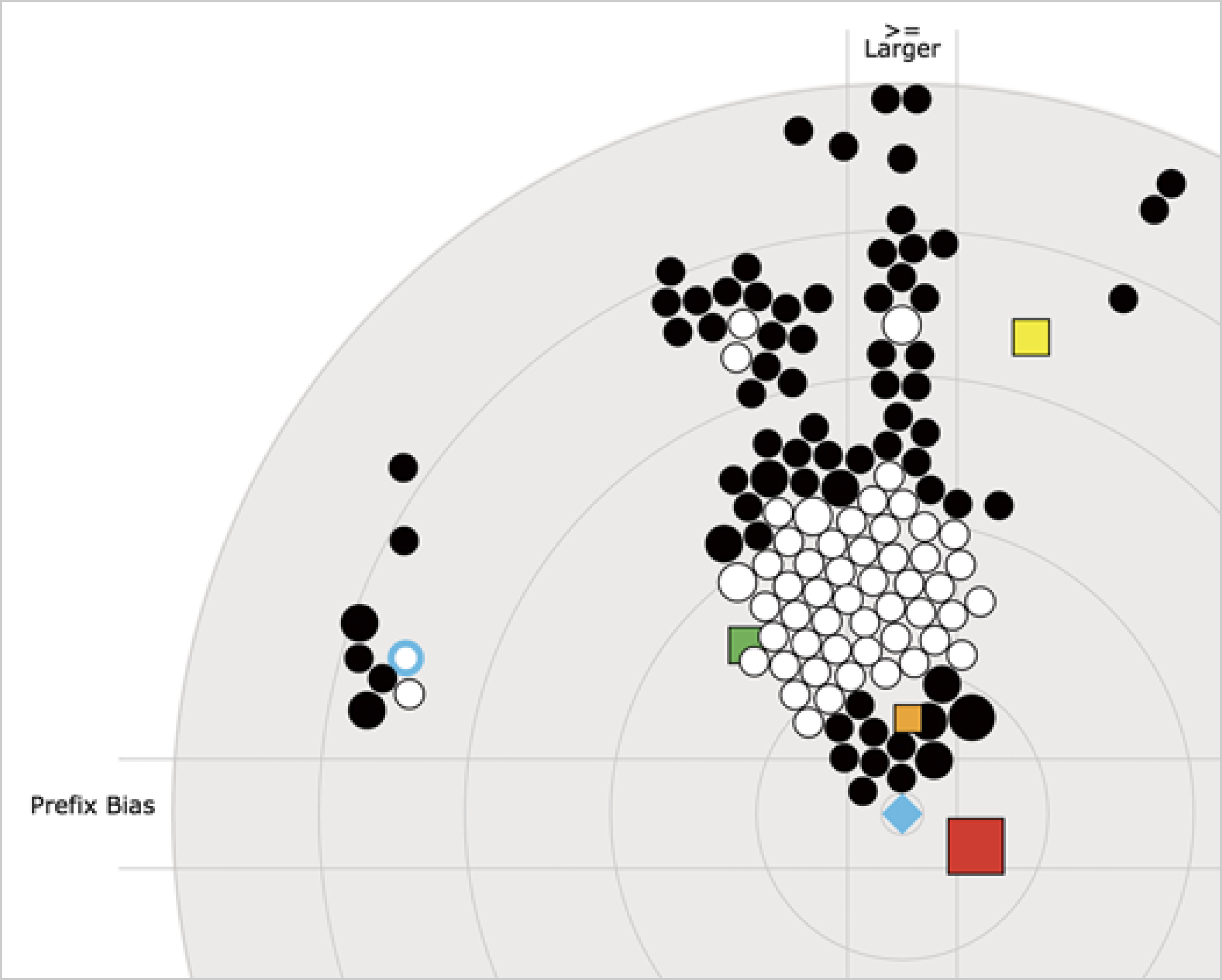
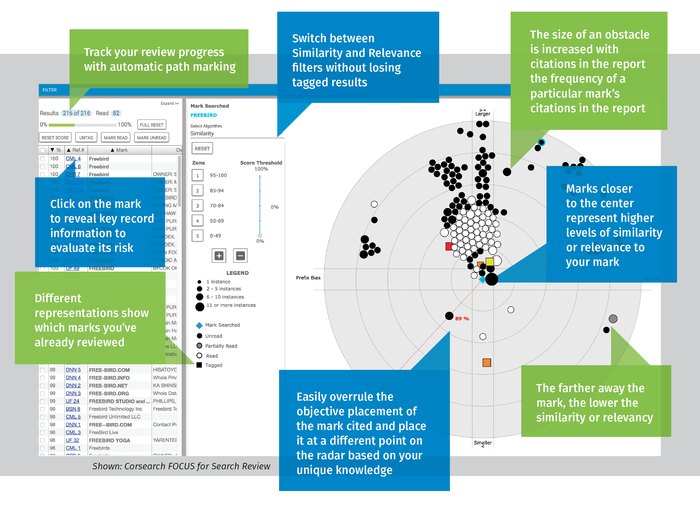
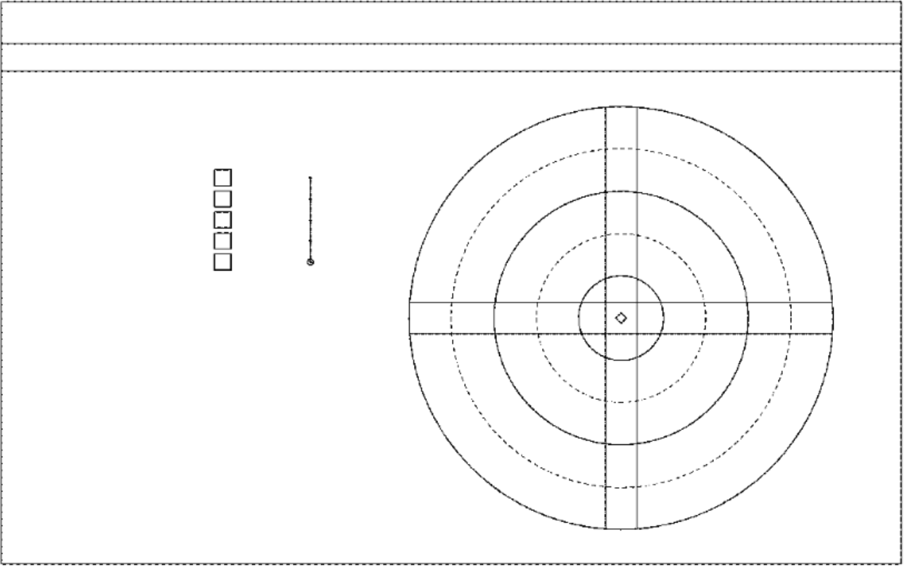
Steve Anderson, Director of Product Management, informed by feedback from expert IP practitioners, ideated and developed a new approach to viewing what was traditionally serial trademark data (list view), visualized on a radar-like dashboard with marks closer to or further away from the mark that the end client is considering — named Corsearch FOCUS™.
This new dashboard view improved the trademark screening and search process and took the drudgery out of the work — with the ability for the practitioner to more efficiently evaluate risk in a visual, almost “gamified” way. They can now clearly see relationships between marks, viewed filtered by Similarity or Relevance, as well as the size of the “obstacles” (the larger the dot, the more marks with the same words/goods & services, therefore more important to look at as a grouping).
The Zones are another time-saving benefit to this interface, which enable the user to strategize which Zones of marks they’re going to review first.

Process
Steve developed Balsamiq mockups of the dashboard and gathered feedback from experts in the industry. We then collaboratively developed the high fidelity UI, which I designed in Sketch and then created an InVision clickable prototype. I determined the shapes, colors, and legend for how the marks would appear on the visualization — pulling components from Google Material Design where possible. We translated requirements and patterns from our Screening and Search product’s other views (List View) over to this new dashboard. The result was an interface that fit in with our existing product and UI, but started to take on a more modern design style, structure, and visual look. I assisted Steve with review as our IT team brought it to life.
Outcome
Corsearch FOCUS trademark data visualization was the first and remains the only of its kind. We launched it at our industry’s largest conference, the 2016 INTA Annual Meeting, where it was well-received. The U.S. and global design patents were assigned in 2018.
Go-To-Market
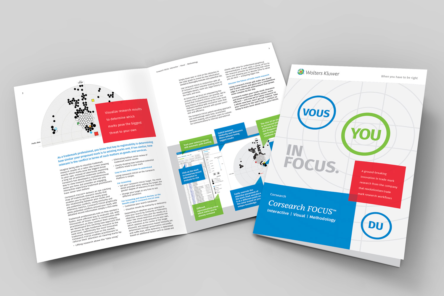
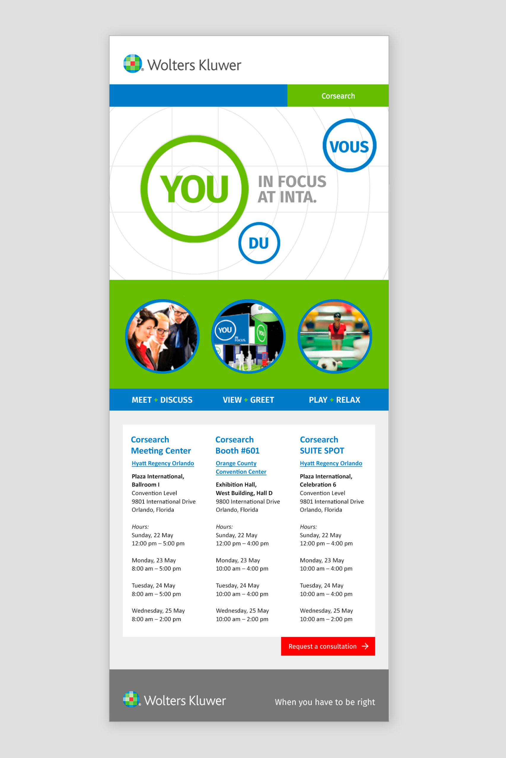
I also designed the marketing materials for GTM, which included landing pages, email campaigns, reference guides, animated demo video, print ads, and brochures — with the larger campaign concept for INTA, “You in FOCUS,” designed by an agency.
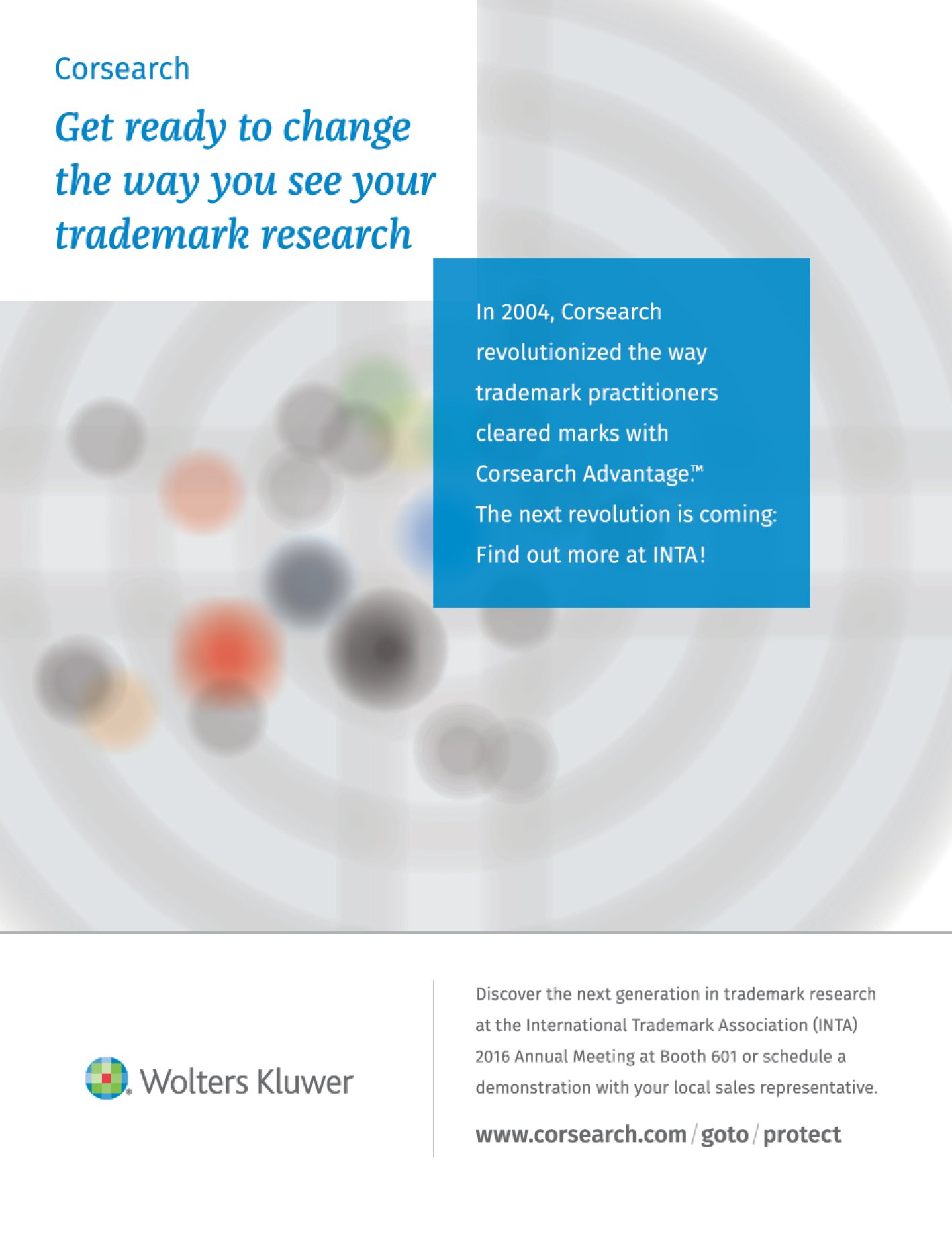
April 2016
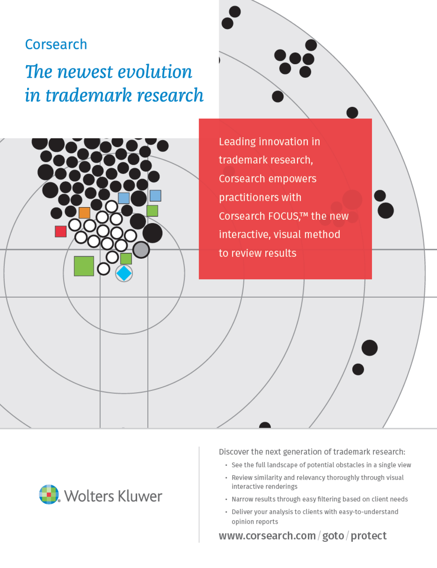
November 2016
Demo Video
(Production Management)
Kim and I worked together in developing the FOCUS product feature at Corsearch. While she handled many functions seamlessly, including Marketing and Go-to-Market implementation, she has a passion for user experience and graphic user interface design. So it was a natural fit for us to partner on the FOCUS product, which was largely about distilling large amounts of data into something meaningful, visual...and interesting. I knew I could count on Kim to make significant contributions to the FOCUS design. She was able to take my rough concepts and turn them into visual solutions that solved market problems.
