Background
A leading Silicon Valley crowdfunding platform for creators and their subscribers was looking to benchmark their B2B dashboards to ensure that the creators were able to find key information about their accounts in order to make decisions about their businesses. The client had a product release (with updates to this functionality) planned in the midst of the study, so it was determined that the experience required benchmarking and that a second study be conducted using the updated functionality before the release to ensure the new experience was improved.
Objectives
- Benchmark the client’s platform (desktop experience) for their B2B audience, creators.
- Work with client’s internal teams to develop test plan and recruit interviewees.
- Conduct remote interviews and usability tests and share findings, insights, and recommendations to the product team.
Process
Developing the Discussion Guide
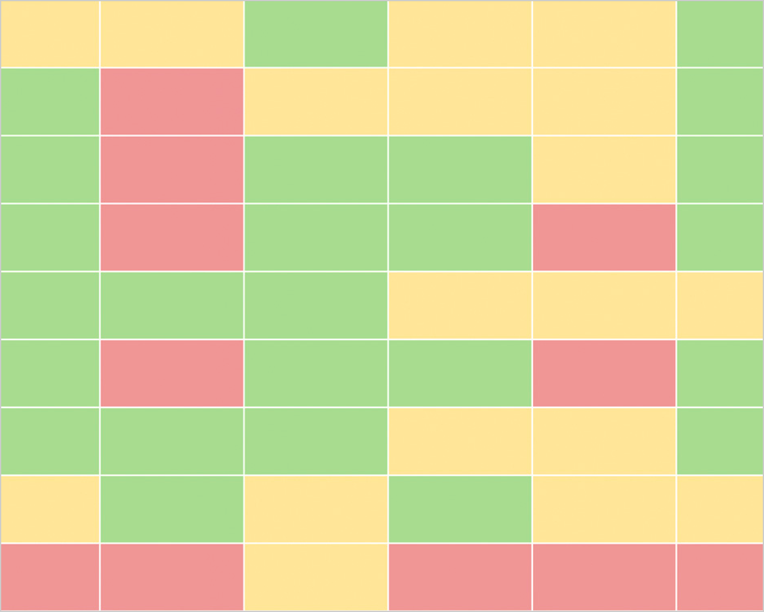
Collaborating with the client’s Head of Product, Head of UX Research, and Head of Customer Care, we developed and tested the guide with the core questions for the interview and screenshots of the answers. We also determined the grading process for the responses, tracked in a spreadsheet which became a heat map:
- Answered / found quickly = green
- Answered / found with some difficulty = yellow
- Not found = red
Recruitment and Outreach
Their customer care and community managers handled recruitment and initial outreach and I followed up to schedule and conduct their interviews and coordinate their incentives. The product team initially wanted only new users (< 2 month accounts) to be recruited but we had difficulty, so we expanded the term to ~1-year.
Remote Interviews / Usability Testing
I independently conducted the interviews remotely using Lookback to record the interviewee’s expression, and actions taken on screen. I took a few notes during the interview.
Identifying Insights and Reporting Recommendations
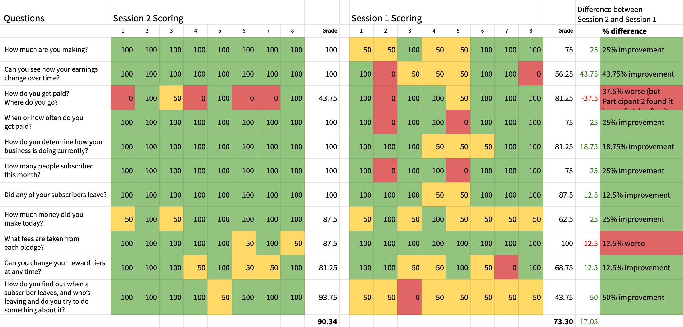
Within 2 days of each interview, I spent hours replaying the videos, transcribing the responses and quotes into corresponding cells on a master spreadsheet which was then graded by color and turned into a heat map. Responses were color-coded by background per the criteria above, and key text was made bold or bold red in order to easily identify issues.
After the interviews were conducted, I looked at all the data for patterns and trends, noting them in another sheet within the overall document.
For each part of the 2-part study I delivered a report and presentation containing all the discovery, personas of the participants, and recommendations. The findings were presented to the product team twice, with the newest findings enabling them to adjust a label on the updated navigation — preventing an issue before the product release.
An overarching presentation and case study showing the outcome of both studies was delivered at the end.
Outcome
The second part of the study showed a 17% improvement from the first part — observing creators finding key information about their businesses quicker and more easily.
Even though the client had an internal UX Research team, it was helpful to them to hire an independent research consultant to conduct this research for several reasons:
- I was able to look at the product with fresh eyes and facilitate sessions with less bias
- it was easier for me to deliver insights / recommendations that may have been difficult for internal stakeholders to hear
- the participants may have felt they could be more candid (though there were a few sessions that the client attended as an observer)
Takeaways
I divided each video into clips, uploaded the clips to the client’s storage drive, and linked them cell-by-cell into the sheet containing the heat map. This was one of the most time-consuming and repetitive parts of the process and potentially unnecessary. I wouldn’t do this for a future project unless the client confirmed they were going to watch — it could be done with markers within the larger video.
I also learned that automated transcriptions (using Descript) require a lot of clean-up to ensure they are properly transcribed (4-5 hours for every hour recorded) — but the act of cleaning up the transcript helped me to better familiarize myself with the content in order to analyze it, so it was helpful in the end. I would try Rev.com for professional transcriptions for future projects and see which method is the best, most efficient way of accomplishing this.
2021 Update: I am conducting a similar study for another client, and after taking a look at Rev.com and several other options for transcriptions, I decided to use Descript again, and the product has greatly improved and made this process much more efficient than it was during this study. The automated transcriptions are far more accurate now — making the cleanup of the script faster (~3 hours for cleanup and analysis per 1-hour interview), and I’m able to export clips of video directly from Descript within seconds, rather than exporting it from separate editing software.
2023 Update: I currently use Dovetail and MURAL to review, tag and synthesize research — finding that it reduces analysis time to to 1-2 hours per 1-hour interview. It’s no longer necessary to continue in-depth transcription cleanup.
A long-form case study of this project is available for presentation in person.
“That was a really fun and detailed presentation to watch. I also just reviewed an in-depth research doc for another company and thought yours was much more engaging. I can’t wait to read your doc over again.”
“Kim and I worked together in two capacities. Here, she helped us benchmark usability quality through attitudinal assessments. Kim's core strength is her ability to take very large and somewhat vague challenges and distill them into just the right execution proposals that executives can effectively act on. She champions research methodology as much as she is meticulous about her outcomes.”
