Background
Every year, Cambridge Innovation Center releases an impact report. In early 2020, I collaborated with CIC’s design lead, Ambrose Reed, with design and execution for the 2019 report.
Objectives:
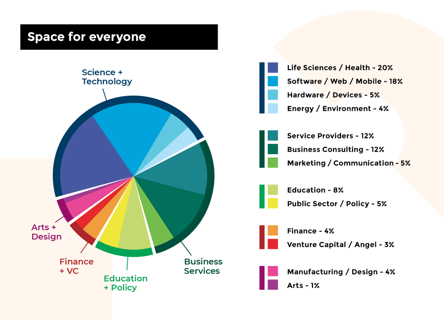
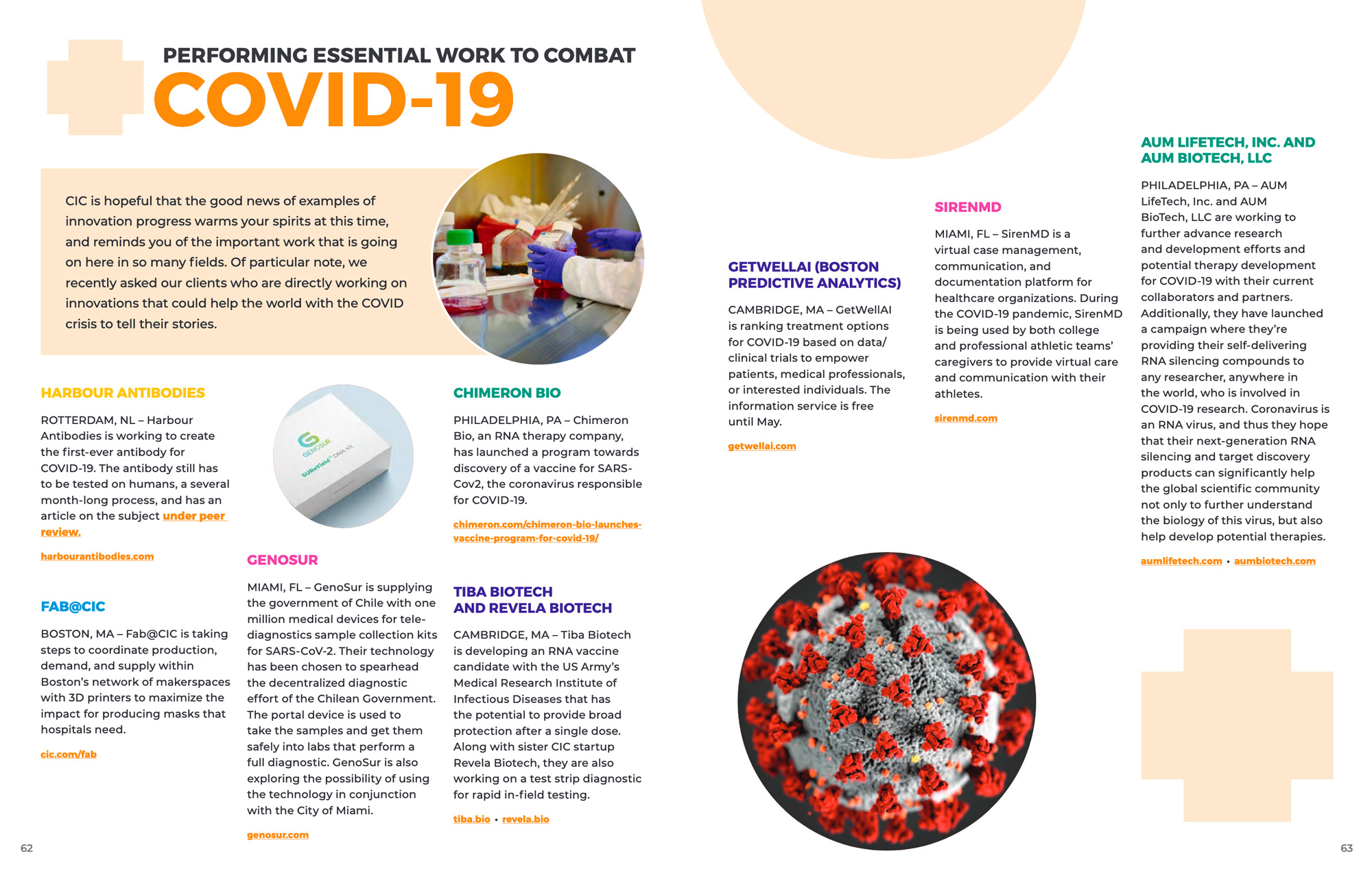
- to highlight the impact that CIC enables within its spaces by providing statistics and client stories to convey growth, success, and client loyalty
- to act as a “look book” for the spaces within, a primary piece of sales collateral that’s available at all locations
Process
We split the work for this 64-page report — Ambrose managed the creative direction and content, I assisted with creative review and pre-production of the files. He designed the feature stories and overarching spreads, and I designed the location-related spreads shown below.
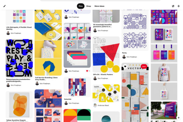
A Pinterest board captured our ideas and provided an easy way to get initial feedback amongst ourselves and direction from the broader marketing team in order to develop design concepts.
Initial Concepts
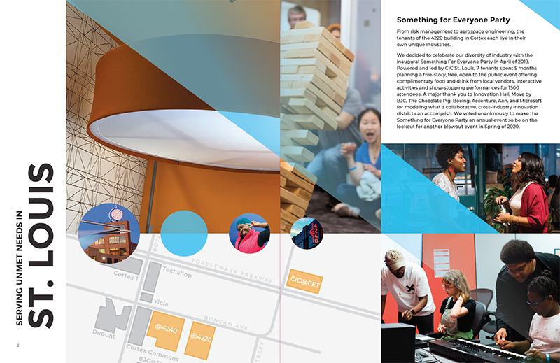
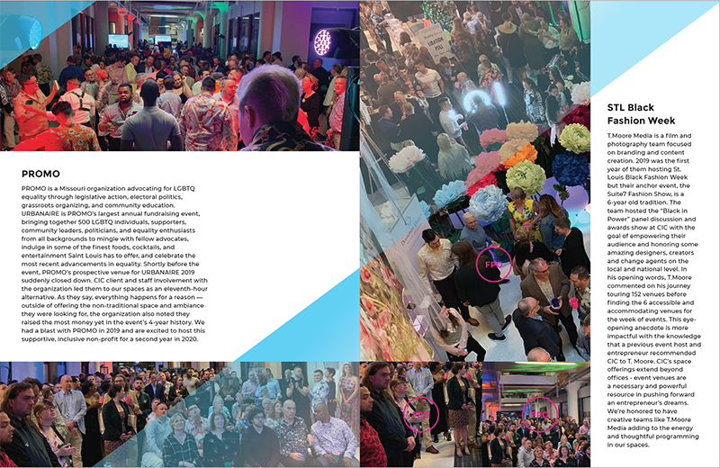

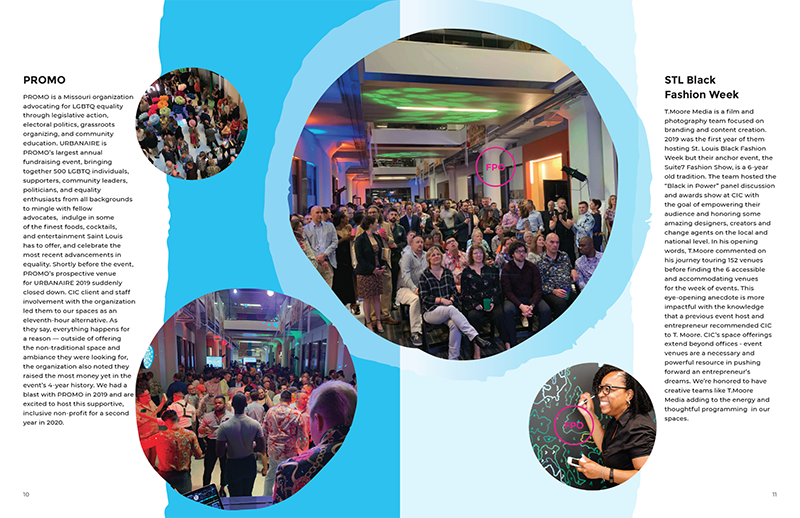
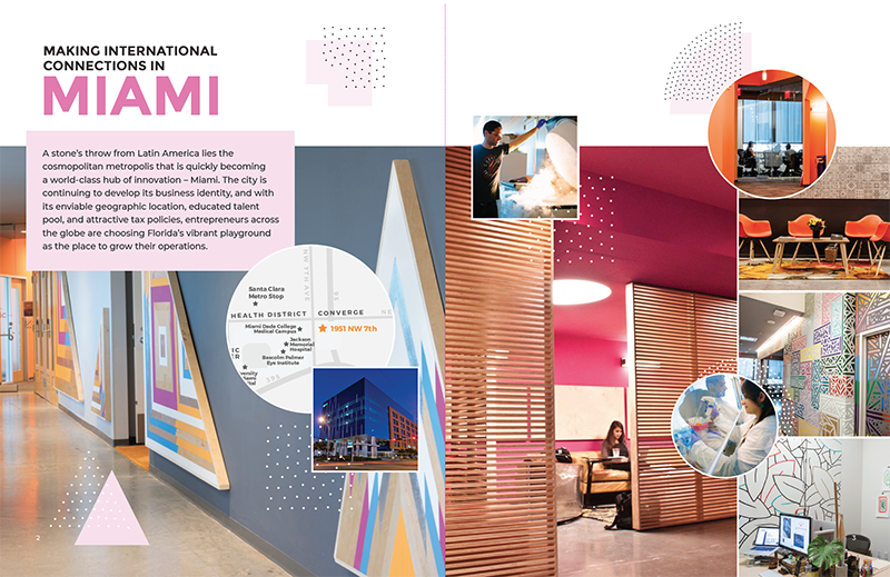
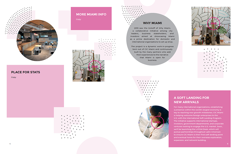
Key stakeholders selected the dot and geometric shape concept and it took some additional experimentation to arrive at the tints, hues, and opacity for the shapes until we arrived at each location’s palette.
Selected Concept: Dots and Geometric Shapes

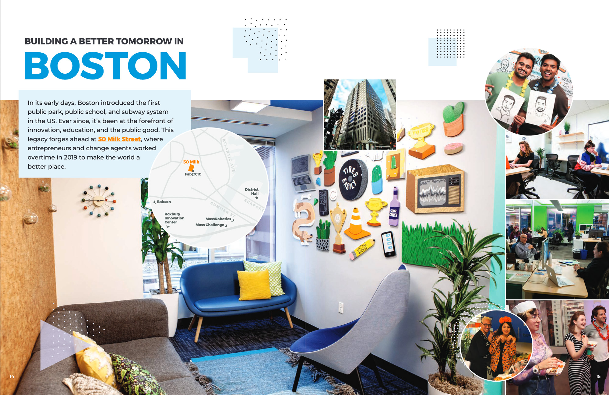
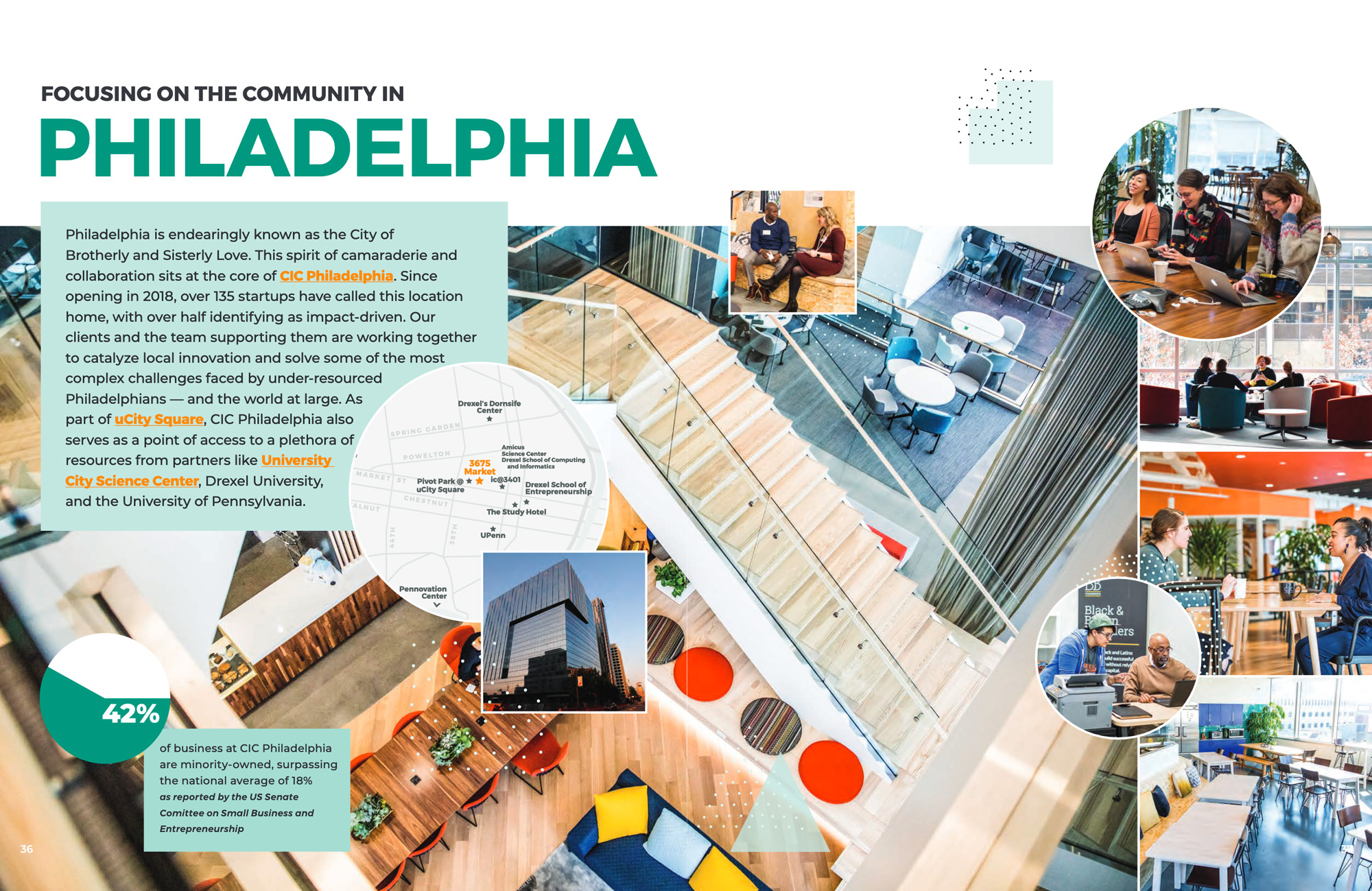
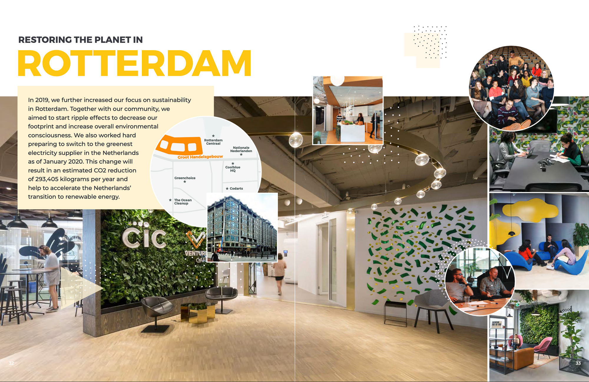
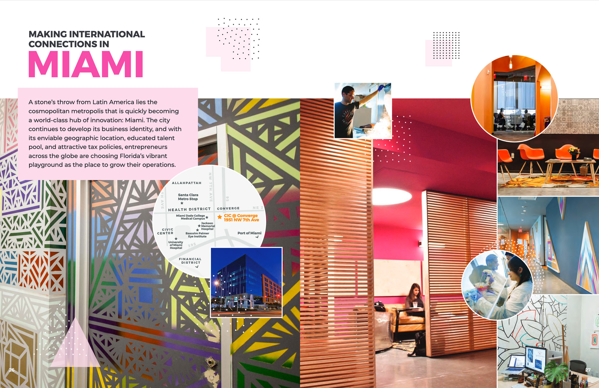
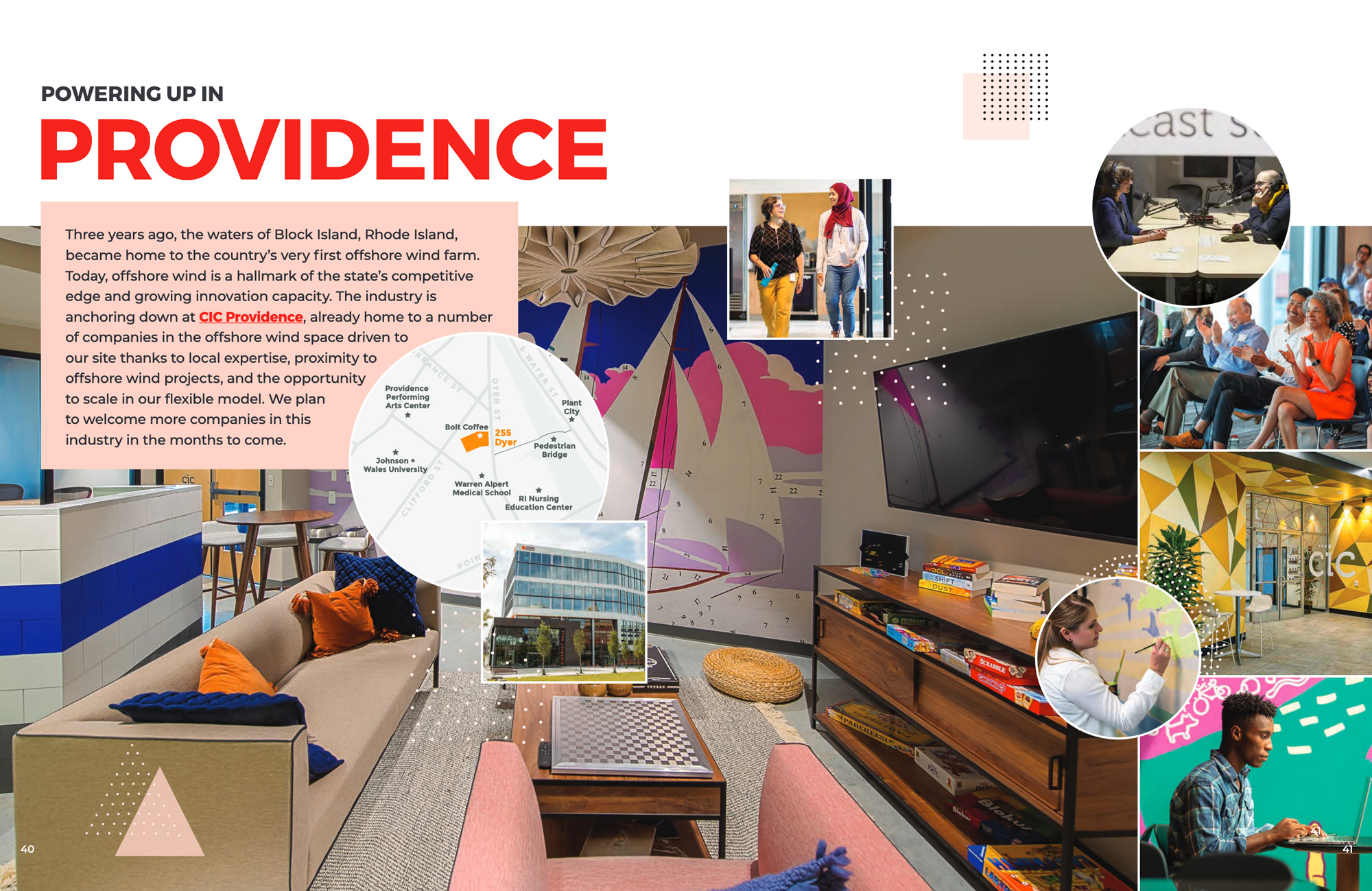
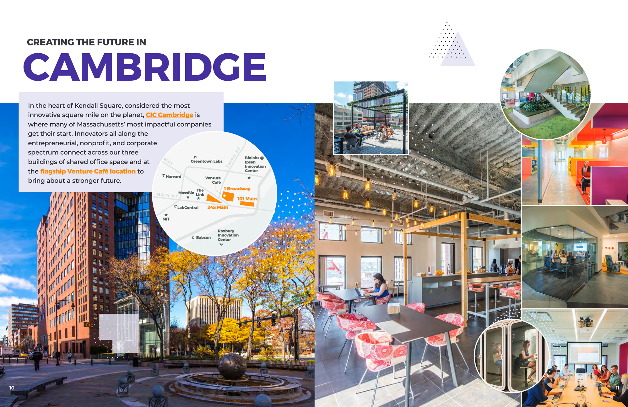
The intro spreads for each location established a color theme for each location that is harmonious with the dominant color, CIC orange, as well as featured a map and images of the exterior and interior of the location. They are followed by impact stories of events and client initiatives.

Result
Final design: colorful, vibrant, and dynamic layouts that captured the energy of the CIC brand and its interior spaces, while highlighting the impactful work of CIC clients taking place within the space.
- Intro spreads: Space for 1 hero interior image to show each location prominently, 5 supporting interior images, an outdoor architectural image, intro text, and a map. Depiction of people interacting wherever possible.
- Interior spreads: Space for multiple impact stories and a supporting graphic for each
