Background
In November 2014, TED determined they didn’t have enough bandwidth internally to overhaul their App Store listings — they knew it was a time-consuming special project and wanted it completed in a month. Knowing I had a background in product marketing (design and copywriting) and UX design, they hired me to reimagine their listings.
This project provided an opportunity to take a deep dive into SEO, Apple and Google Play app stores, and get to know TED and its positioning in its unique market from a verbal and visual perspective.
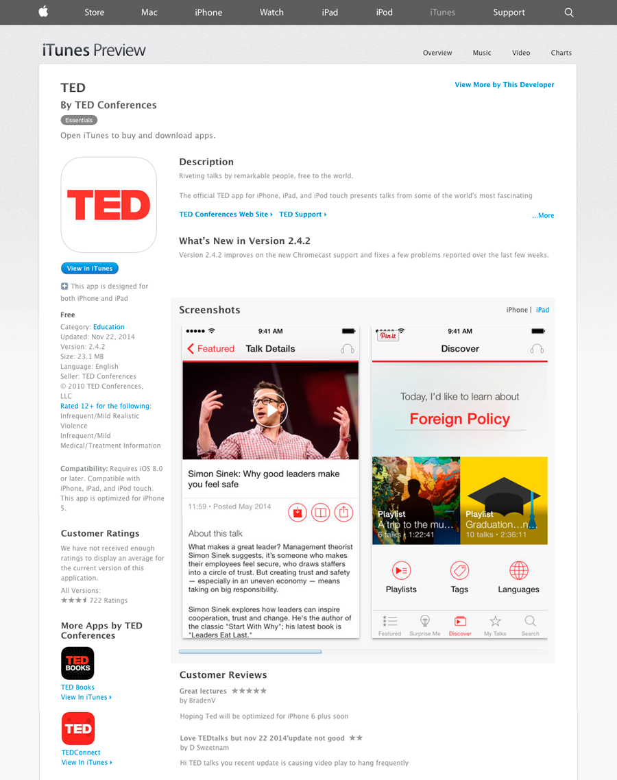
Prior to the project, TED’s app store listings were screenshots with a separate description — nothing visually informing the viewer of the app’s unique functionality in contrast to watching a talk on TED’s website.
iTunes App Store Listing: Before (11.2014)
Objective
Overhaul TED’s App Store Listings using best practices for App Store Optimization. Because the budget didn’t allow for paid SEO tools such as App Annie, I conducted the research without it.
Process
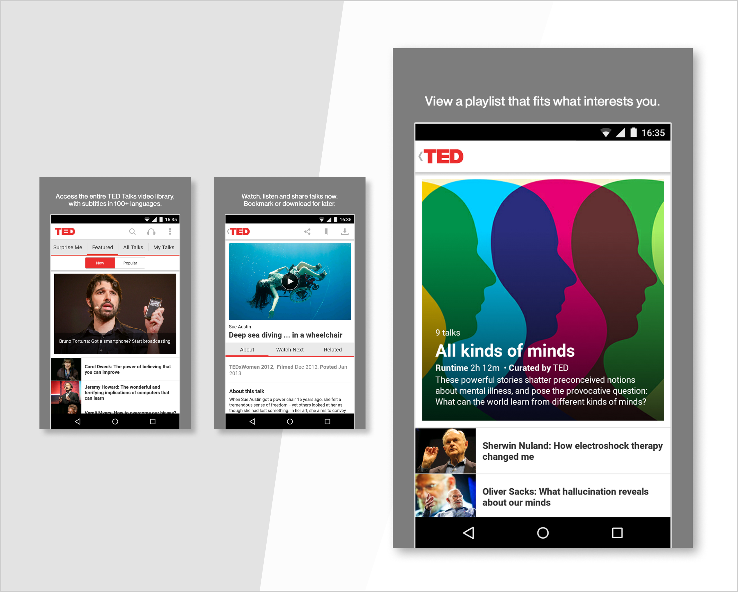
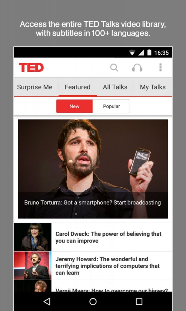
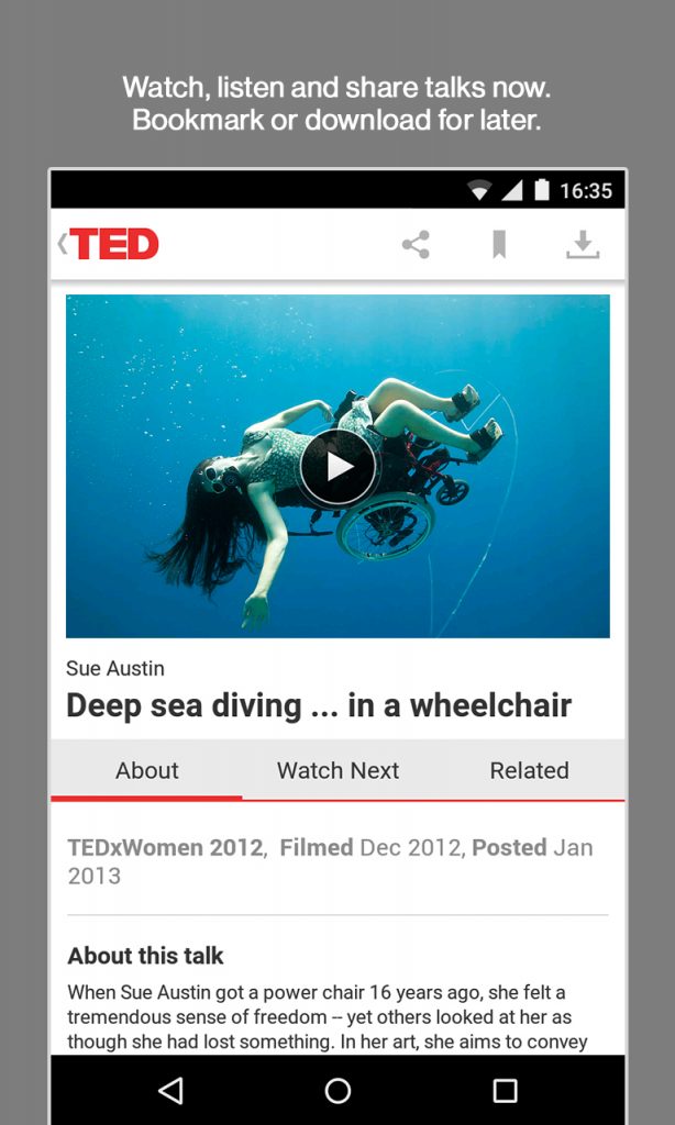
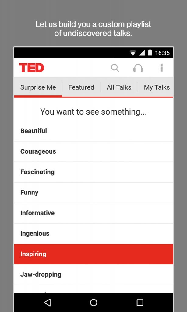
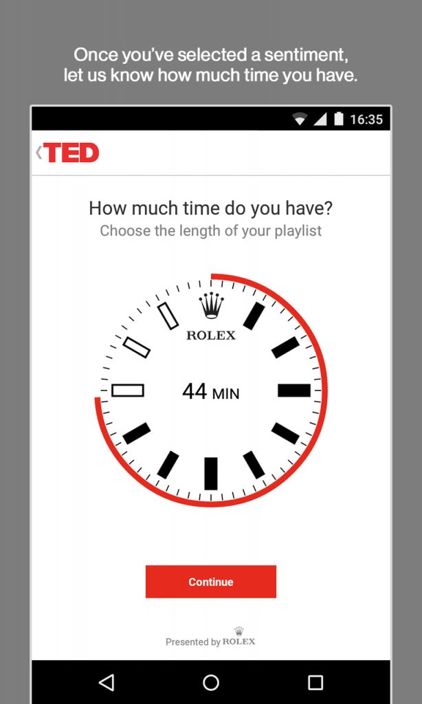
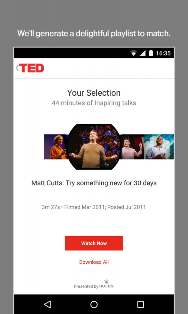
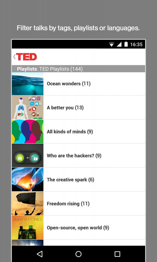
After looking at comparable listings in each app store and seeing a pattern, it was determined we’d need to create a new series of screenshots to highlight the app’s functionality as well as TED’s content by showing imagery with descriptive headlines which could resonate with the audience.
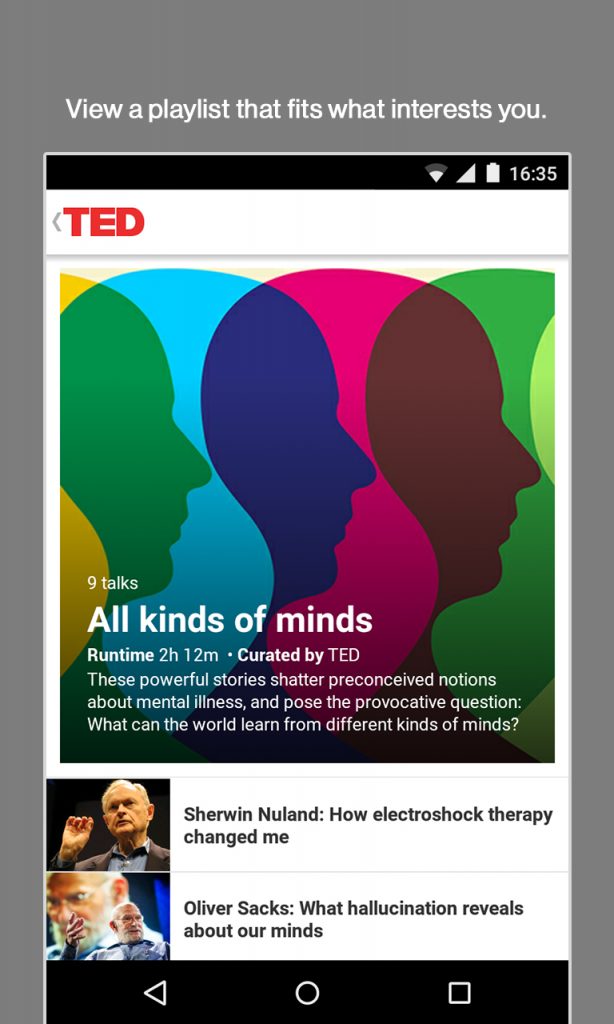
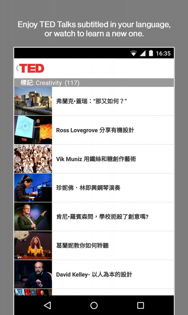
Apple’s App Store allowed 5 images to be shown, and Google Play 8, to entice visitors into downloading the app through the magic of storytelling. I watched hours of TED talks to find the most representative and compelling imagery to capture. The product team and I determined the series of functions to highlight, and I then collaborated with TED’s copywriter, Morton, to write the headings for each graphic and TED’s designer, Lillian, to ensure the designs were compliant with guidelines. After the initial images were developed, I developed the same assets for 7 devices in portrait and landscape.
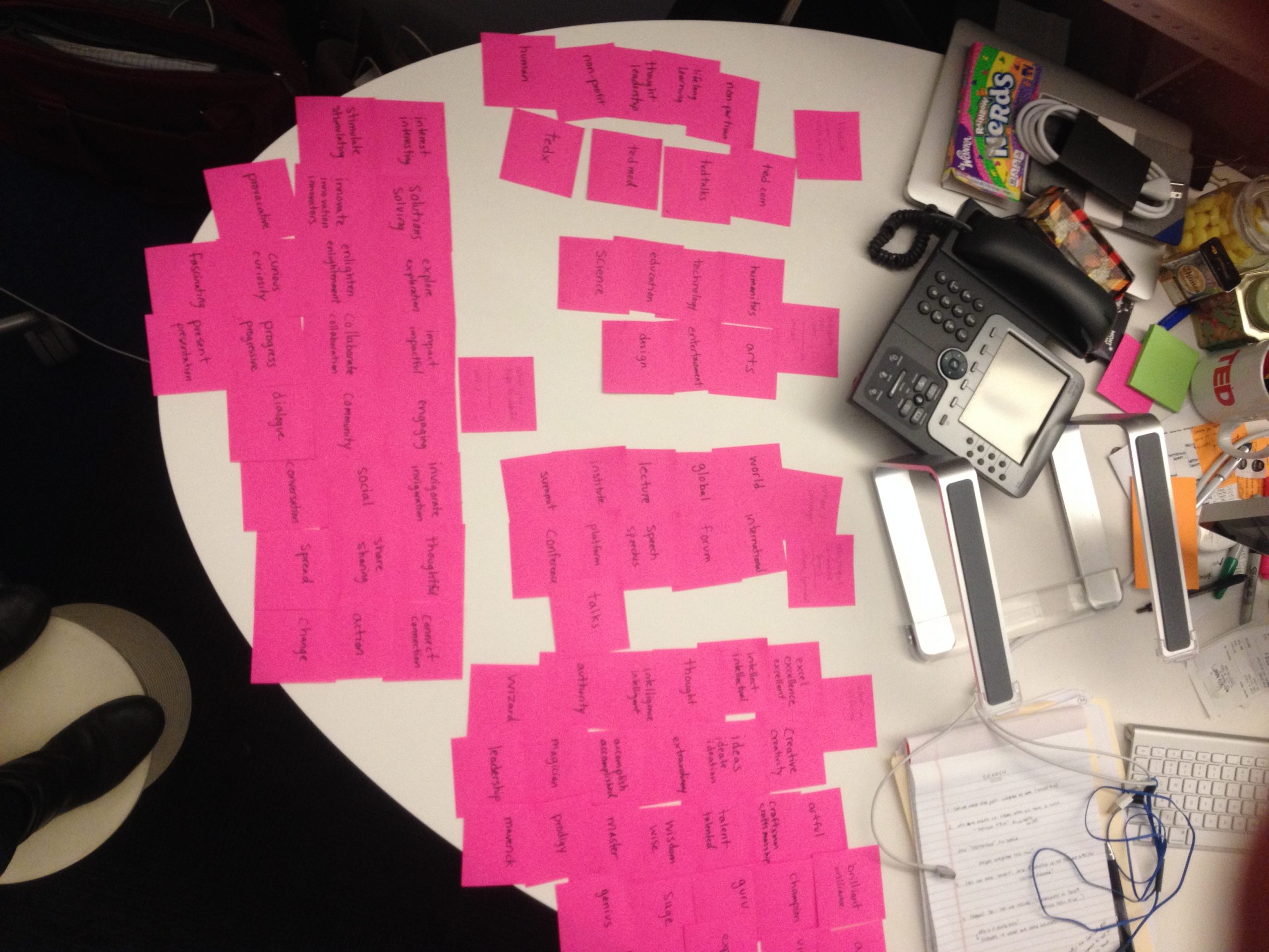
Affinity mapping keywords pulled from all mentions of TED
Deliverables: Updated Google Play Screens
Outcome
TED’s app store listings were updated with interesting, informative, branded and compliant listings; and TED was provided with the documentation and process to facilitate updating the listings more frequently internally moving forward.
Even though it wasn’t part of the requirements for the project, I delivered a list of “unofficial” apps which informed TED of potential brand disparagement.
Takeaways
I learned the process of writing and storytelling for an app store when you have constraints of few screenshots to get your product’s best features across.
For future projects I would use market data analytics software to identify keywords and analyze app store presence metrics, and follow up with the client to request performance metrics for the new listings to determine its effectiveness.
I would also conduct interviews with app “prospects” to get their feedback and ensure the listing shows and tells them what they want to know.
“Kim and I worked together in two capacities — once while I led product at TED and once at Patreon. Her work at TED was to conduct competitive analysis for the TED app and make appropriate marketing recommendations. She did a phenomenal job covering topics from creative approach to taxonomy to setting up the right conversion funnels.”
